Modern Operating System and Vertical Space Efficiency
While working on Industry Idle’s spiritual successor CivIdle, I’ve decided to use Windows 9x/2000’s UI style as the in-game UI and spent a lot of time in Windows 2000 in a Virtual Machine. After a trip down memory lane, I suddenly realized how much vertical space is wasted on my modern Operating System (Windows 11)
Just look at a side-by-side comparison of Windows Explorer on Windows 2000 and Windows 11 on my 1080P monitor. On Windows 2000, the detail view shows 54 files/folders, and on Windows 11, only 27 (exactly half) manage to fit!

What’s more ironic is that Windows 2000 is probably not designed for vertical space efficiency particularly, considering that when it is first released, most monitors have a 4:3 aspect ratio. In fact, if it is designed with a 16:9 aspect ratio in mind, the address bar probably can be moved up and combined with the icon bar (like in Windows 11).
To further quantify the difference, I fired up a photo editing software and started to measure each element’s pixel size.
| Element | Windows 2000 | Windows 11 | Note |
|---|---|---|---|
| Title | 19px | 31px | Windows 11 include tabs |
| Menu | 24px | - | No menu on Windows 11 |
| Icon | 24px | 56px | |
| Address | 24px | 48px | Some icons are on the address bar |
| Content | 939x | 874px | |
| Status | 24px | 24px | |
| Task (Start Menu) | 26px | 47px |
(Note, because the border of each element collapses, I only measure one side of the border)
Looking at the number, an obvious conclusion is that system decors (taskbar, tile bar) take up much more space than before. This prompts modern applications that need to optimize for vertical space to completely ditch the standalone title bar. Some applications render tabs (e.g. Chrome) and some render menus (e.g. Visual Studio Code) - it’s less consistent but honestly not the end of the world. The bigger problem is the taskbar (Start Menu), which is completely out of the control of applications. Also, the height of UI elements is much less consistent compared to Windows 2000.
After deducting all the operating system decors, Windows 2000 has 939px of usable vertical space for “content”, a merely 65px more than Windows 11. But somehow it can render twice the amount of items. Each row in the table view in Windows 2000 has a height of 17px while on Windows 11, it is 35px (27px + 4px margin on the top and bottom side). In case you are wondering maybe the font in Windows 11 is bigger - it is not: both measure an x-height of 6px.
Here are a few more examples:
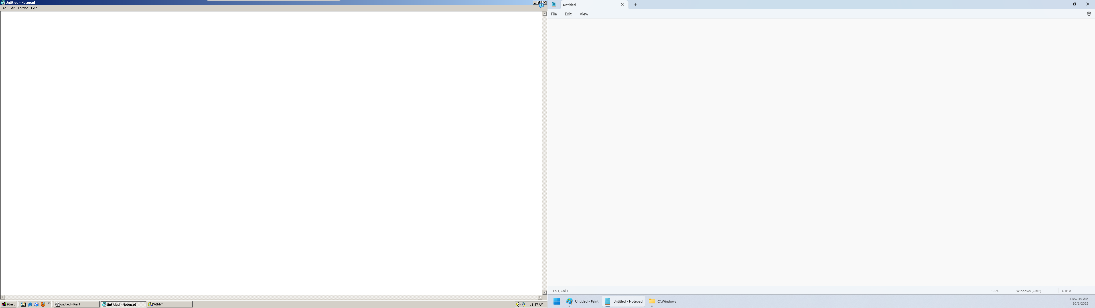
Notepad is the best example to illustrate the extra vertical spaces wasted by modern OS decors.
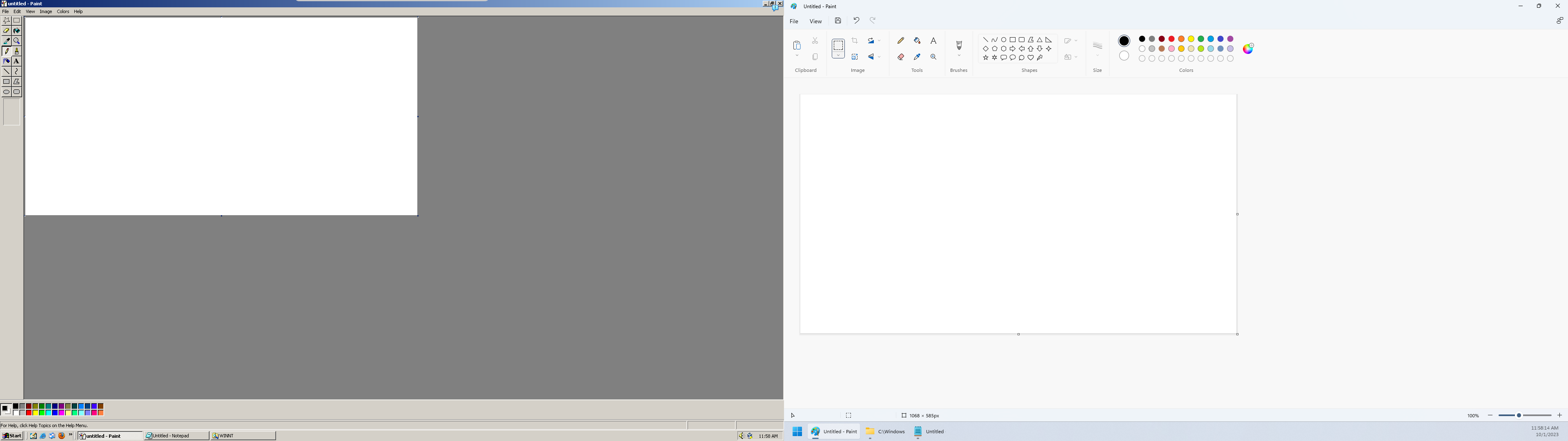
Paint is another interesting case - it has gone through a modern redesign, only to make the vertical space less efficient. Converting from the menu to the ribbon UI drastically reduces the available vertical space for the canvas. Moving the left toolbar to a horizontal one makes it worse.
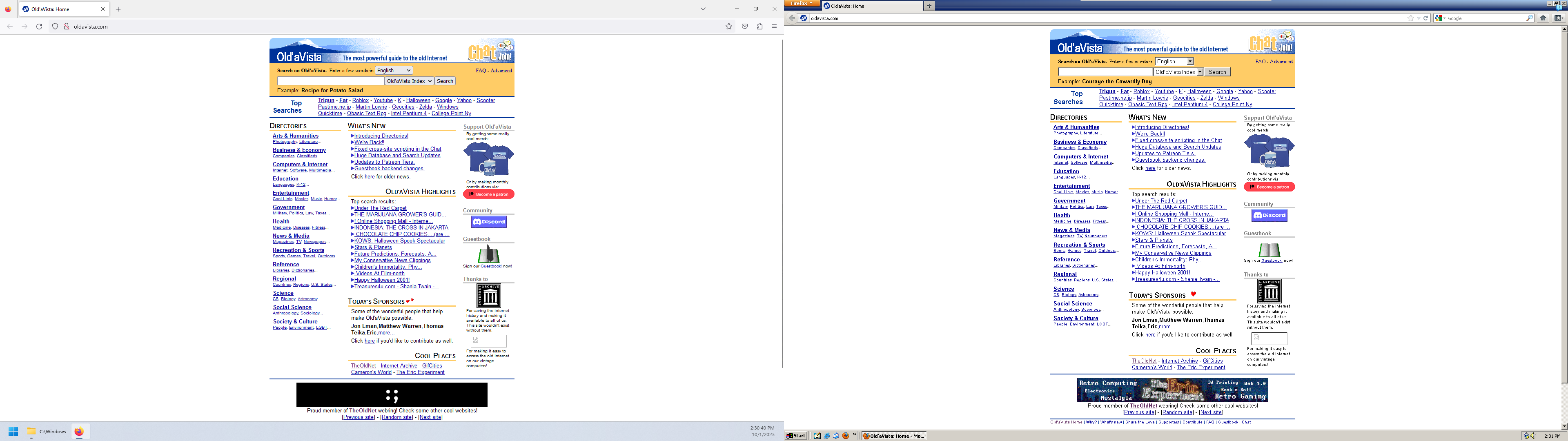
Firefox is a third-party application that has vertical space optimization in mind. But apart from the extra vertical space wasted by system decor, the application itself does not help either. Note on my Windows 11, Firefox is running “Normal” density, which is the more compact mode. The other officially supported density is “Touch”, which adds even more margin.
Going back to my original motivation for researching Windows 9x/2000 UI - I was a bit worried that following a UI guideline and standard that was introduced more than 20 years ago would make my game UI look “off” - turns out it looks alright.
The information density is much higher without sacrificing much usability - after all, if a button looks like a button, you don’t need the extra margin to separate it from the rest of the content. And the classic widgets are surprisingly versatile to accommodate the needs of a complex management/simulation game.